VorlekVorlek

Main News Movies Games Favorites Reviews Stats 2 Fans
Add to Favorites

Contact Info / Websites

Tom unveils redesign?

4/15/11 by Vorlek
Updated 5/11/11

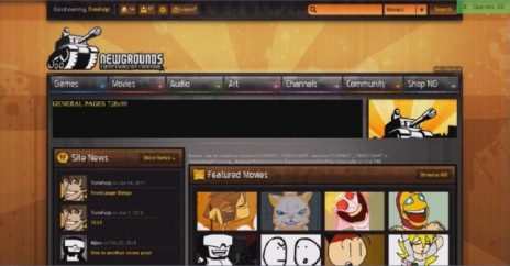
Well, Tom gave us a supposed sneak peak, of the upcoming redesign. Here it is:

EDIT: In this news post, Tom said that the new layout will be rougly 977 pixels wide. If we take the image below, and then scale the thumbnails up to 140x90, which is the new thumbnail size, it does come to rougly 977pixels.

newgrounds_redesign2.jpg


Comments

You must be logged in to comment on this post.


Chdonga Chdonga

4/15/11

I don't know if you're bullshitting or not, but it's not as bad as I expected.

Still, I wish we could keep the old design. It's grown on me.


Yeah, much nicer image than what was posted on the BBS.

I am not a fan of the golden honey brown color. I prefer the neutral greyness of Newgrounds as it is now and was before the last redesign. I agree about the neon highlights on the buttons and the background looks like they are using a desktop wallpaper.

Come to think of it, that could just simply be a user style did up all custom like for or by one of the staff.

Thanks for the image. I am gonna go click some of your ads and vote five on yur flash.


Can you upload that to your Dumping grounds? I hope they never change the perfectness that is Newgrounds.

4/15/11 Vorlek responds:

Never used this dumping grounds stuff before :3 but here we goooo:
http://www.newgrounds.com/dump/it em/7ce18263b03eb53e8ed14e30914671 4e

When the last redesign happened, I wasnt too keen on it at first, but I have to say, looking back at the old design, the current one is way better.
I like the idea of the top bar in the screenshot though, although i doubt this is the actual design, maybe its something they have been thinking about.

I dont like the "photoshop brush" look to the background and the "bevely" buttons and stuff though, sorta makes it look like the old design.